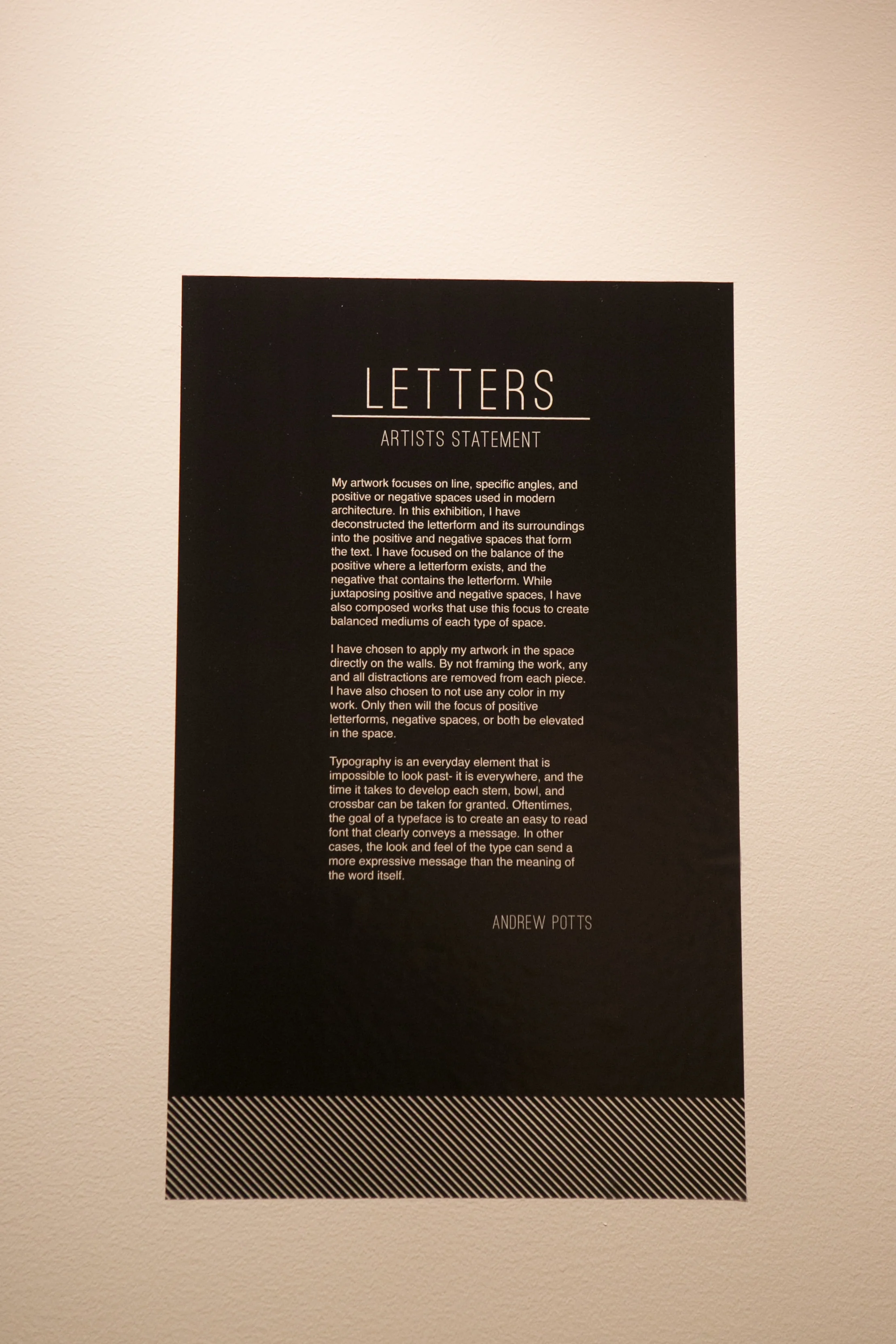
LETTERS: Senior BFA Exhibition at Lindenwood University in St. Charles, Missouri.
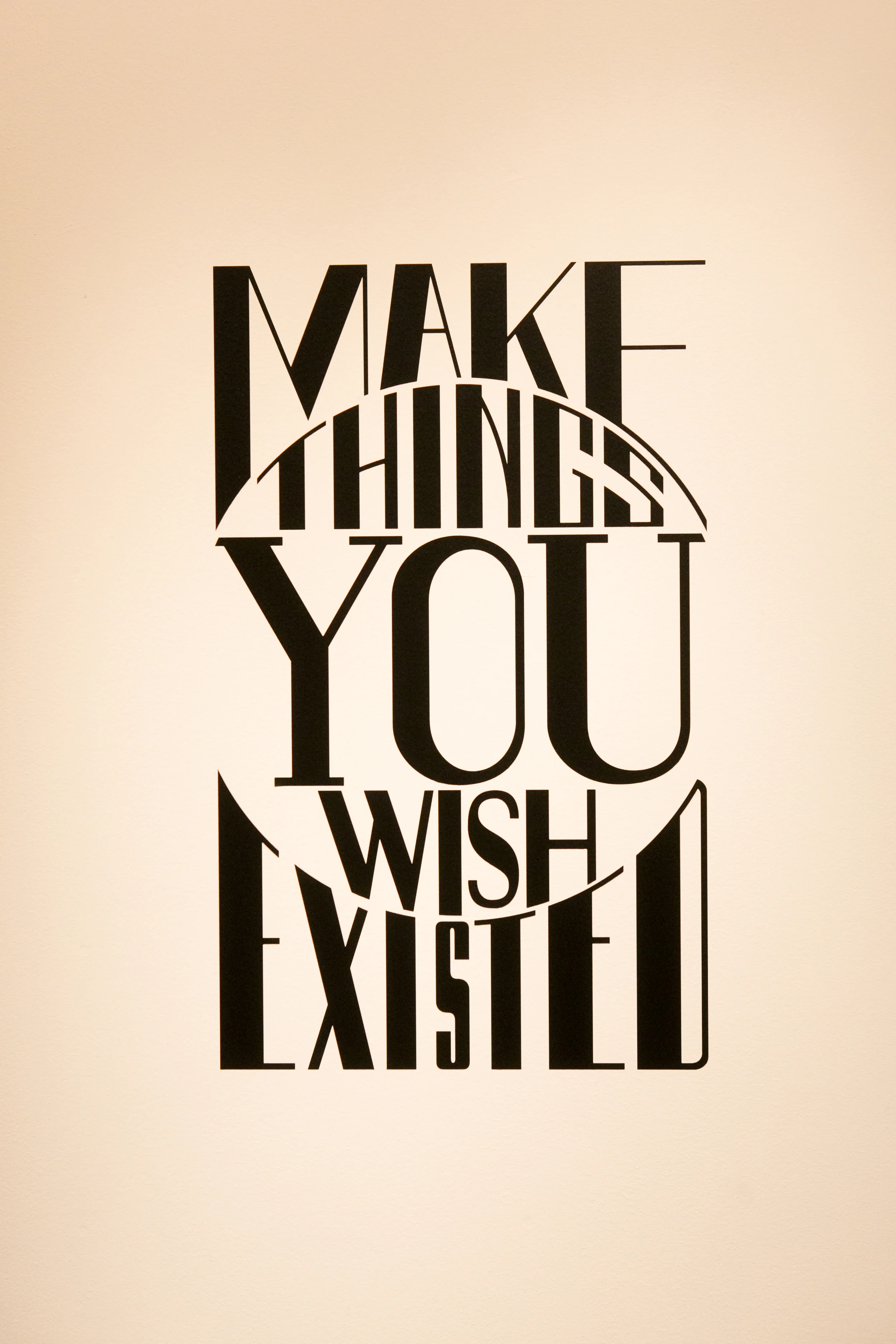
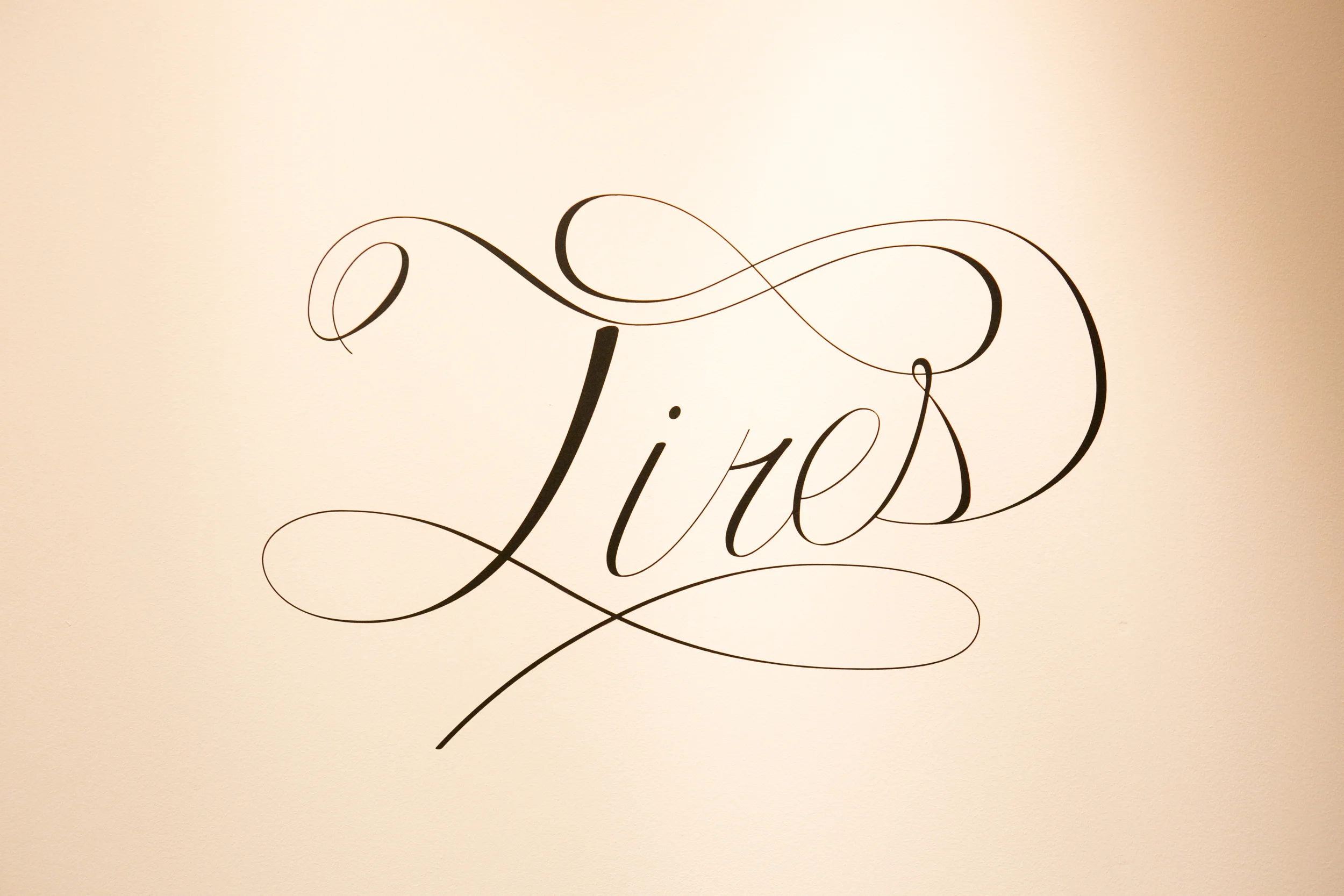
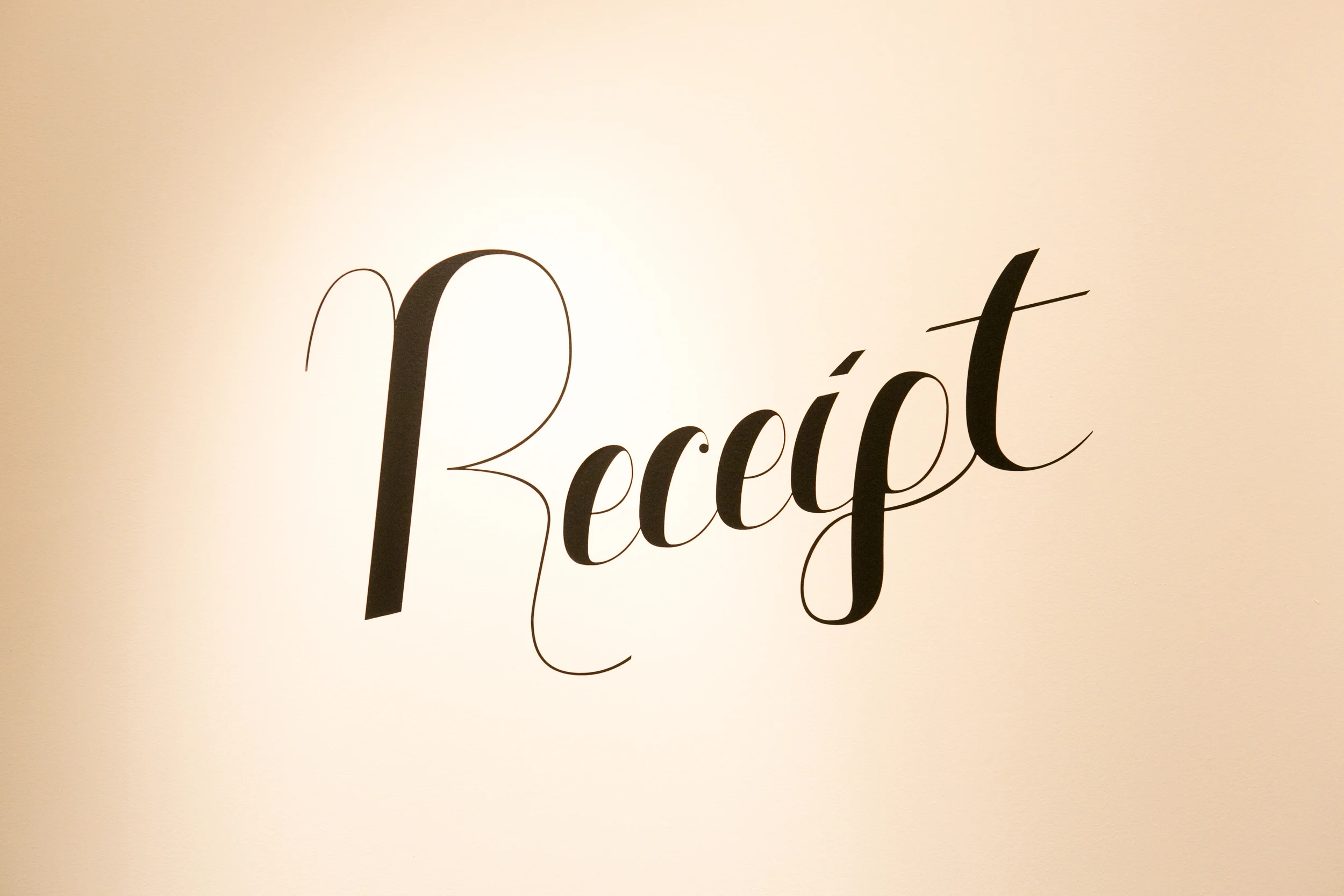
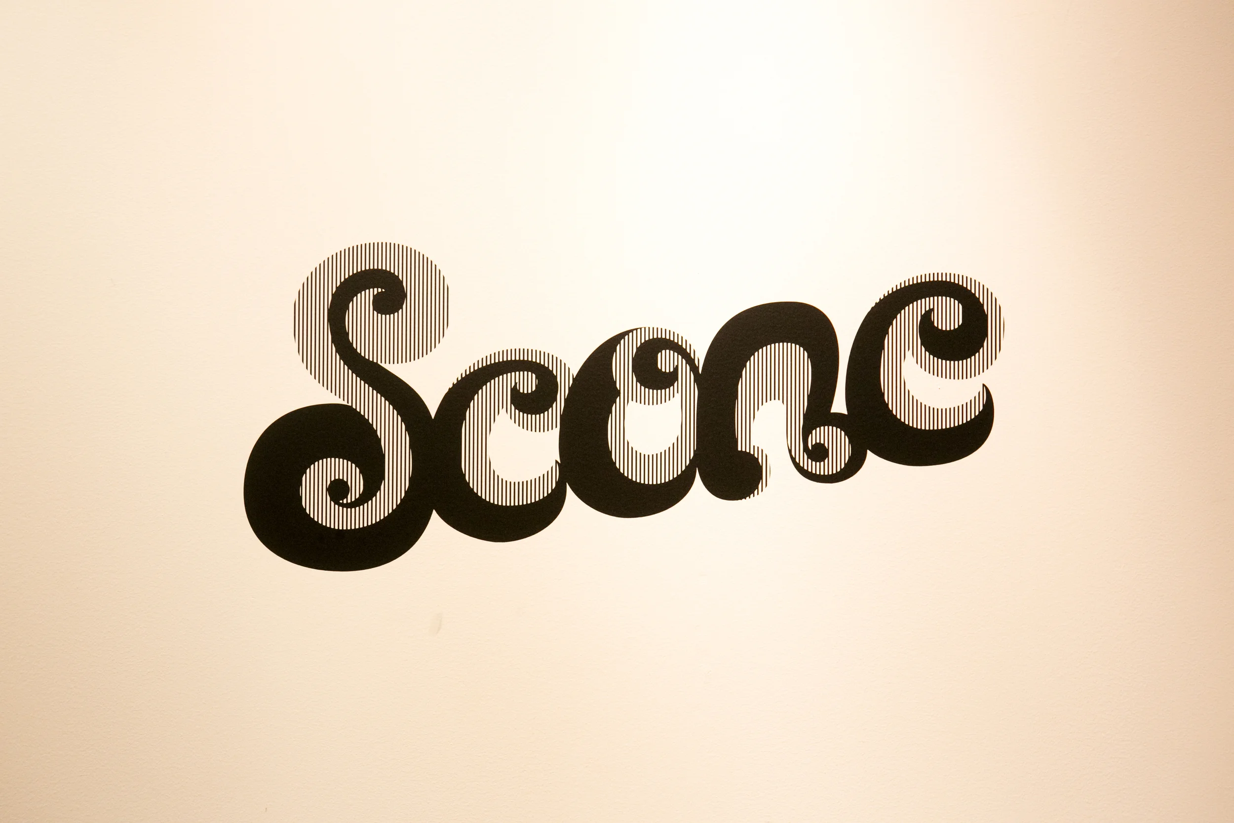
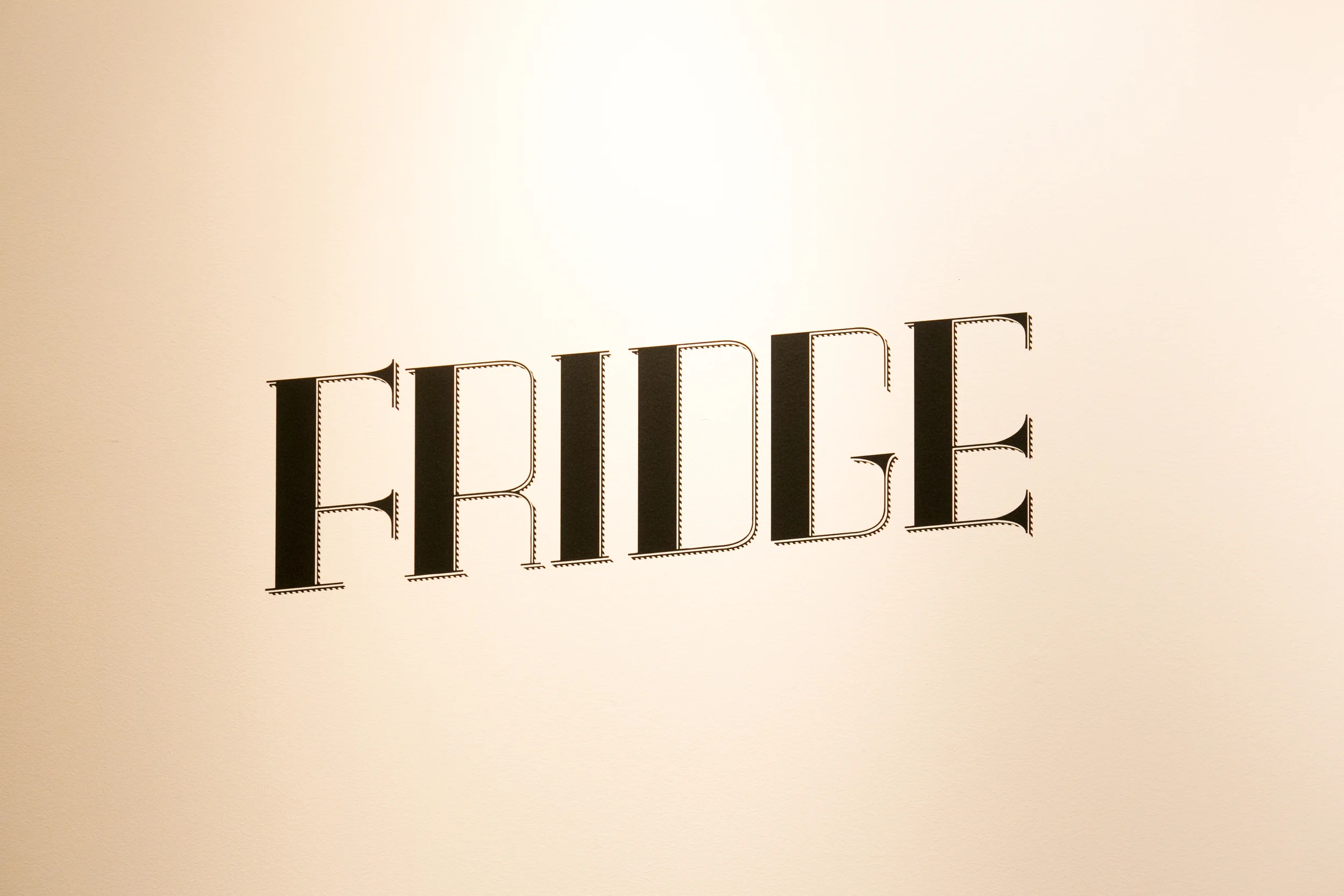
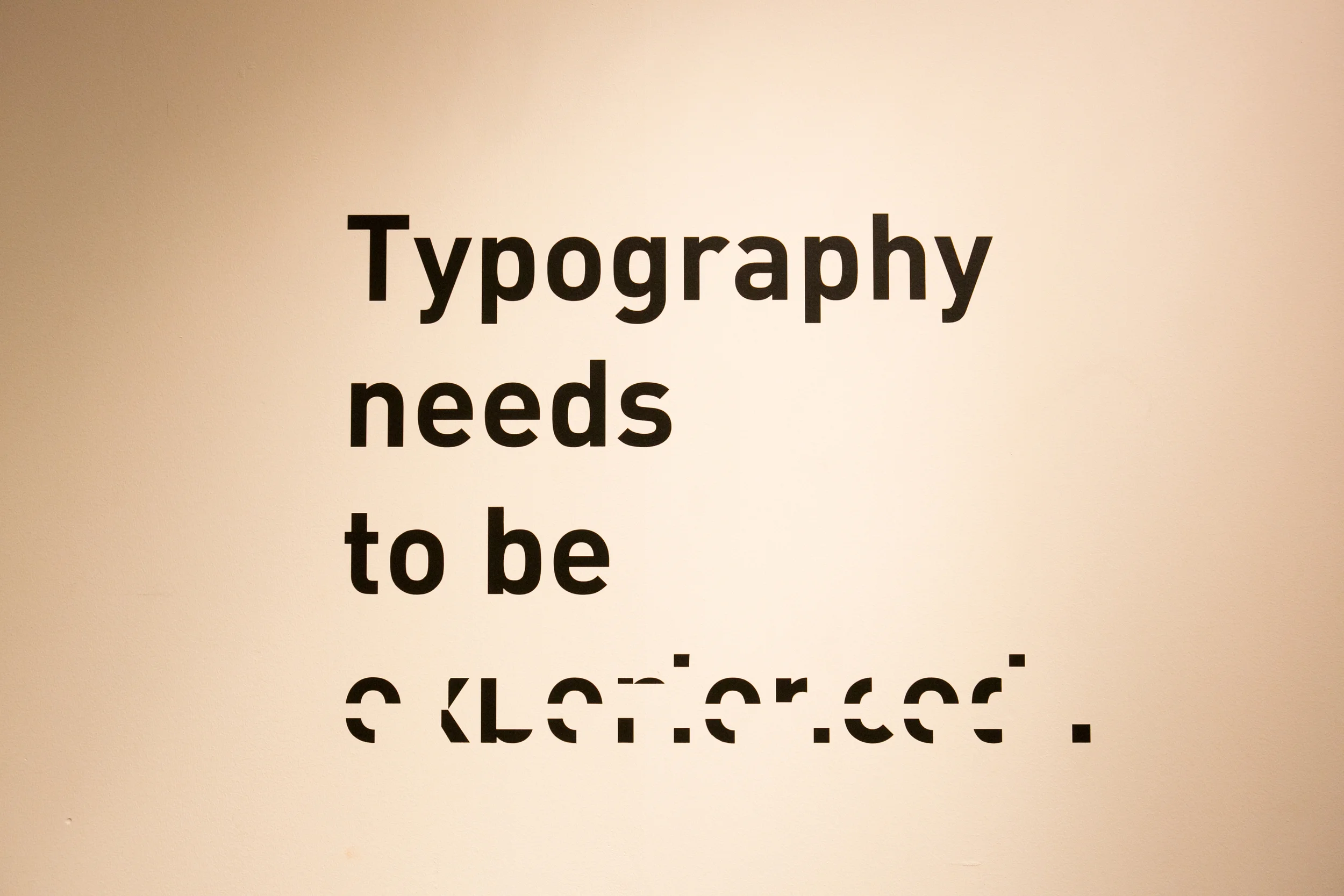
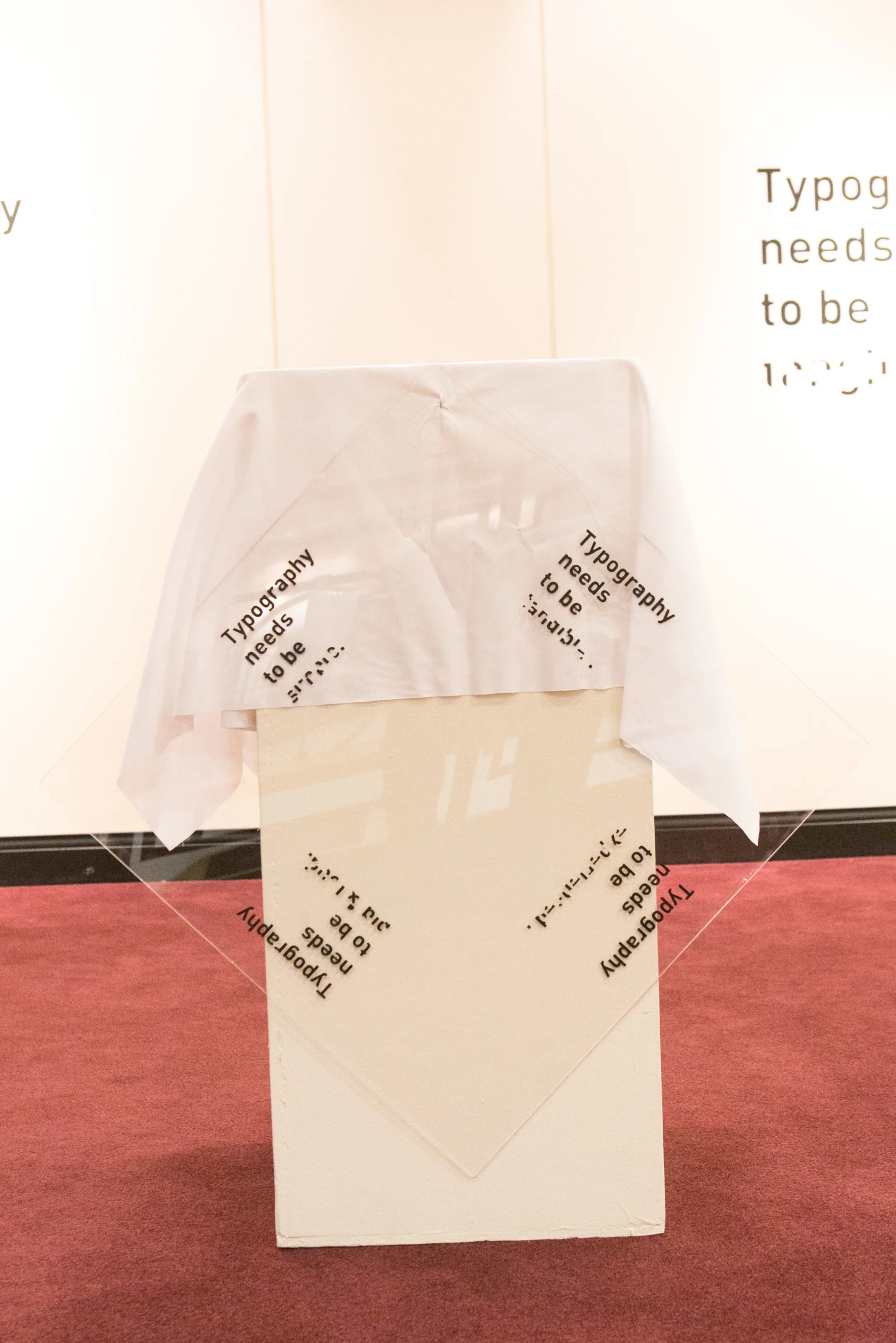
My Exhibition was based on typography and how most people see it, and then what I see. I have deconstructed the letterform and its surroundings into the positive and negative spaces that form the text. I have focused on the balance of the positive where a letterform exists, and the negative that contains the letterform. While juxtaposing positive and negative spaces, I have also composed works that use this focus to create balanced mediums of each type of space.
I have chosen to apply my artwork in the space directly on the walls. By not framing the work, any and all distractions are removed from each piece. I have also chosen to not use any color in my work. Only then will the focus of positive letterforms, negative spaces, or both be elevated in the space.
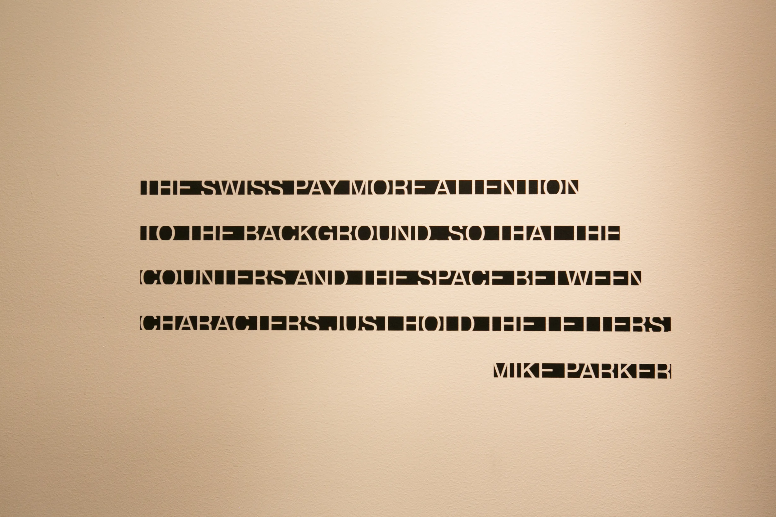
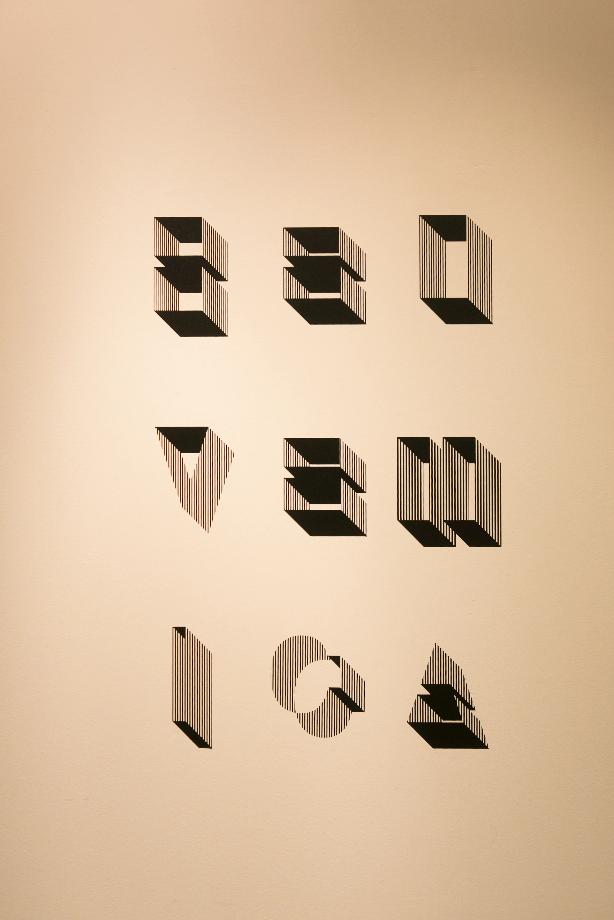
Exhibition Works
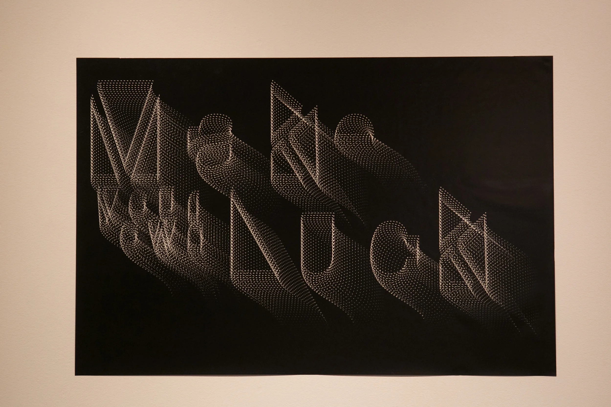
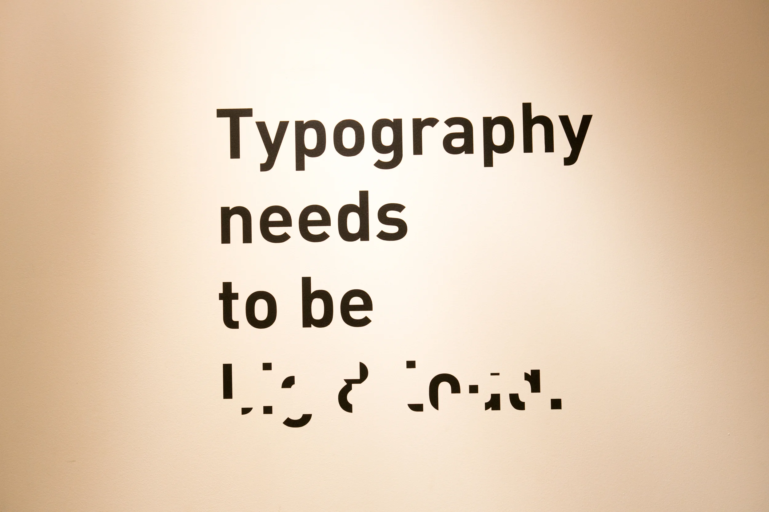
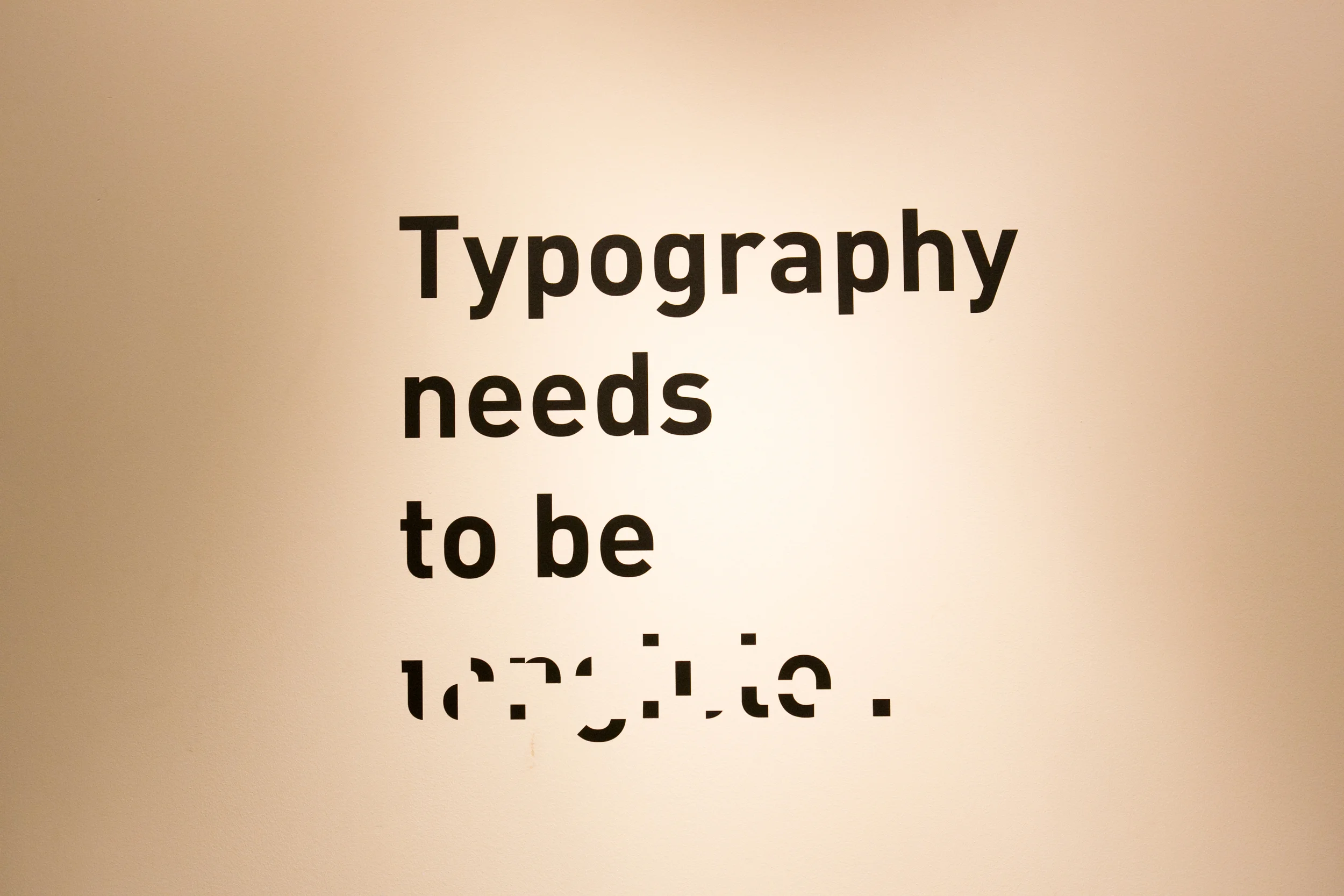
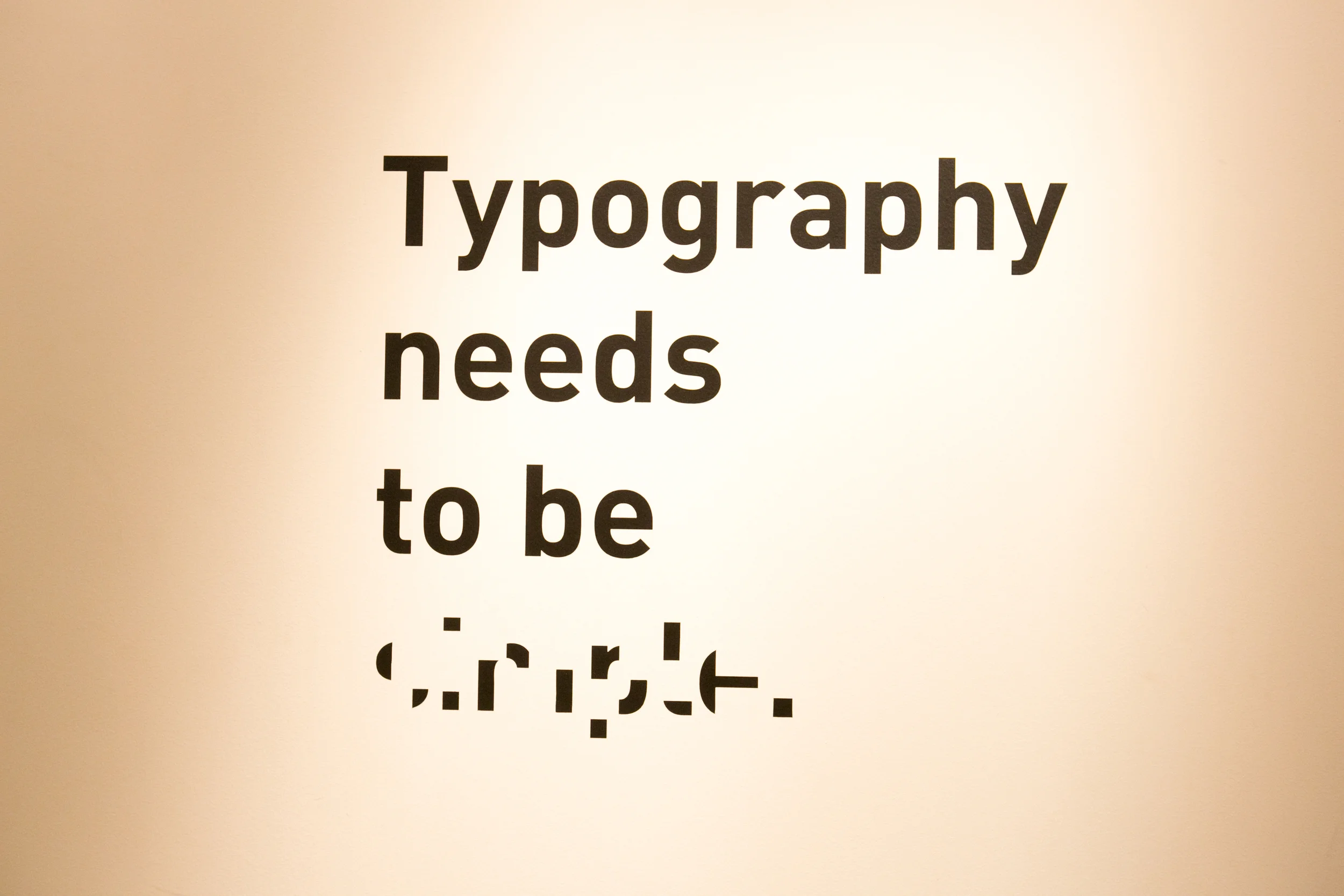
Interactive Typography
Some works included interactivity where the viewer used a key to solve the abstracted type on the wall. Each piece focuses on an element of typography which I believe is essential in order to be successful. The key contained four solutions which matched only one abstracted word on the wall. The viewer was responsible for positioning the key in order to create the solution. After interacting with each piece that viewer realized that their actions are physically reflecting what words are on the wall.